



































In this article
A potential customer opens your enquiry form on a phone between meetings. They know what their business needs help with, but the form asks them to choose an internal service label, state a technical specification and complete several fields before explaining the problem. They put the phone away.
That situation does not prove the form needs fewer fields in every case. It suggests the questions may not match what the customer knows at that moment. East Bay web design for a professional service or B2B business should help the right person describe a useful request without making them understand your internal process first.
The examples here are illustrative design exercises. They do not claim a measured change in conversion. Use them to review the information your receiving team actually needs, the effort required to supply it and the feedback a customer receives when something goes wrong.
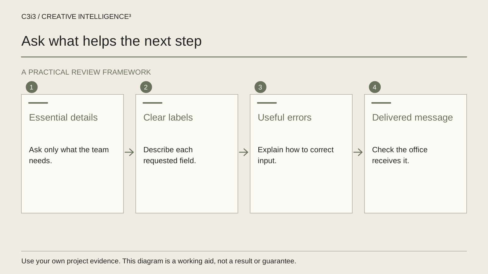
Which fields help your team decide what to do next?
Start with the receiving team rather than the existing form. Ask what they need to decide whether the request is relevant, who should handle it and how to reply. Then identify which information must be supplied immediately and which can be discussed later.
A professional service enquiry may need a contact method and a description of the problem. A specialized product request may need an application or a relevant technical detail. The right information depends on the task; there is no single field count that suits every business.
For each required field, write the decision it enables. “We might use it someday” is different from “we cannot route this request without it.” If a field serves a reporting preference rather than the customer’s immediate task, consider an optional question or a later collection point.
The W3C forms tutorial recommends focusing on information needed for the process. Apply that principle alongside your operational requirements rather than removing useful qualification indiscriminately.
Compare the form with the website enquiry journey. A field cannot correct a page that attracts the wrong task, and a clear page cannot compensate for a form that the customer cannot reasonably complete.
Are you asking the buyer to speak your internal language?
A customer may recognize their problem without knowing which division, package or technical service name applies. A required dropdown filled with internal categories can force a guess. That guess then travels into the receiving team’s workflow as if it were a reliable answer.
Use labels that describe the customer’s situation. Where a category is necessary, add enough explanation to make the choice understandable and provide an honest route for uncertainty. “Not sure which service” can be useful if the business has agreed how those requests will be reviewed.
| Unclear question | More useful direction | Why the distinction matters |
|---|---|---|
| Select business solution vertical | What do you need help with? | Invites the customer to describe the task |
| Technical requirements, required | What should the product or service help you do? | Separates a known goal from unknown specifications |
| Company information | Business name, if relevant to your request | Explains what the field is asking |
| Describe everything about the project | Briefly describe the problem or project | Sets a manageable starting point |
These examples are not universal replacements. A procurement team may have precise technical requirements and appreciate a dedicated route. The design should recognize that situation without forcing every first-time visitor into the same specialist questionnaire.
Can the visitor understand each field after they start typing?
Keep labels visible and specific. A placeholder can provide an example, but it disappears as the customer types and should not carry the only explanation of the field. The W3C guidance on labeling controls describes associating labels with the relevant fields.
Place instructions where they are needed. If a field requires a particular format or an attachment has a restriction, tell the visitor before they encounter an error. Do not assume that an instruction at the top of a long form will remain visible when a phone keyboard covers part of the screen.
Mark required and optional information clearly. A visitor should not have to submit the form to discover which apparently ordinary questions are mandatory. Where an answer is conditional, show the relationship without hiding an essential requirement in an unexpected place.
The W3C form instructions tutorial is useful for reviewing how labels, examples and supporting instructions work together. Implementation details matter, so have the delivery team test the actual accessible behavior rather than approving only the wording in a design file.
Review the completed appearance too. A field that seems clear when empty may become ambiguous after it contains a long business name, an email address or a multi-line project description.
What happens when someone makes an ordinary mistake?
People make mistakes on forms, especially on a phone. The design should help them understand what happened and correct the problem. A generic red message saying “invalid submission” does not tell the visitor which answer needs attention.
Write the expected correction in plain language. If the email address is incomplete, identify that field and explain what is needed. If a required choice is missing, refer to the visible label. Preserve valid information where the implementation can do so appropriately instead of making the customer start again.
The W3C notification guidance covers clear feedback for errors and task completion. Use it as a review reference, then test how the delivered form presents and announces the messages.
Do not treat an error as merely a cosmetic state. It affects where focus moves, what remains on screen and whether someone using assistive technology can identify the next action. An implementation needs inspection by the responsible team, not just an error-color choice.
Also distinguish a correctable input issue from a service failure. If the request cannot be accepted because the receiving service is unavailable, the visitor needs an accurate message and an appropriate alternative route. Claiming success in that situation hides the failure from both the customer and the business.

Does the mobile form work as a complete task?
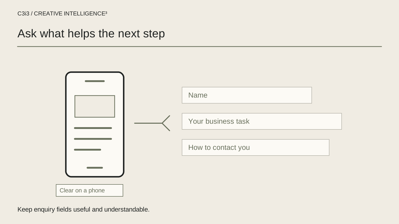
Test the form on a narrow display with representative content. Follow it from the service page rather than opening the form in isolation. Check whether the visitor understands why they are there, which information is needed and what will happen after submission.
Use the normal input methods available for the task. Check long entries, corrections, keyboard movement and the point where the on-screen keyboard reduces the visible area. A field should not become impossible to understand because its label is outside the customer’s current view.
Ask someone unfamiliar with the internal service categories to explain what they think each question means. Their interpretation can reveal an ambiguity that the project team has stopped noticing. This is a small usability exercise, not a statistically representative performance claim.
Record a problem as an observed task failure: what the person tried, what they expected and what happened. “The form is too long” may be a useful concern, but the record becomes more actionable when it identifies unnecessary data entry, unclear choices or repeated corrections.
For the page surrounding the form, consider landing page design as part of the journey. The message, evidence and request should continue the same customer task rather than handing the visitor a disconnected questionnaire.
If a complete rebuild is already being discussed, use the checks before a website redesign to establish whether the form needs a focused repair or depends on a wider structural change.
Who receives the enquiry after the customer finishes?
The final test continues beyond the public success message. Send approved test data and confirm that the intended receiving team can find the request, understand the customer’s problem and take the agreed next step. Avoid submitting confidential customer information just to make a test realistic.
Check the routing arrangement as part of the review. A useful request can still be delayed when everyone assumes someone else monitors the inbox. Identify who owns incoming enquiries, how an uncertain request is assigned and what happens when the normal contact is unavailable.
If the request does not arrive, use the form delivery incident guide rather than changing labels at random. The public form, processing service and delivery route are separate parts of the task.
The Bay Area service hub provides the existing geographic context for East Bay work. This guide adds a specific form-design question rather than another location page. For the wider sequence, return to which marketing problem to fix first.
A complete review records both visitor usability and business receipt. That gives the team a concrete acceptance task: the right customer can describe a relevant need, receive accurate feedback and reach a person responsible for reviewing it.
Keep this checklist beside you
Questions before the next step
Should a business enquiry form always be short?
It should ask for information appropriate to the task. Some specialized requests need more detail than an initial general enquiry. Review what is essential now, explain unfamiliar requirements and defer information that is only useful later. Test the resulting task rather than assuming that the fewest possible fields will always produce the most useful enquiries.
Can placeholder text replace a visible field label?
It should not carry the only explanation of the field. A placeholder can offer an example, but it disappears as the person types and does not replace a properly associated label. Review visible wording and accessible implementation together so the customer can understand and check their answers throughout the task.
How do we know whether the form or the traffic is the problem?
Inspect them separately. Review whether visitors are arriving with a relevant need, then test whether the form lets an appropriate customer complete the intended task. Trace an approved submission through to the receiving team. These observations help identify the failure without assuming that a traffic report alone explains what happened.

How C3i3 Can Help
C3i3 helps East Bay businesses connect web design, clear enquiry questions and a working delivery route. Bring the form, the requests your team needs and the points where customers get stuck. We can review the customer task and define the design or support work that needs attention.